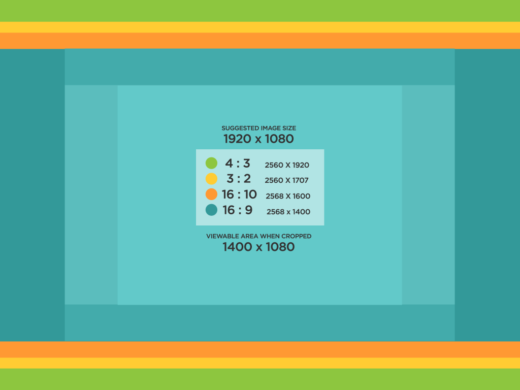
Placing images on WordPress’ content area can sometimes be a problematic issue especially when it comes to the issue of responsiveness. Therefore, we wanted to create a guideline that would help you decide a good approach on how you could or should take advantage of this functionality.
IDEAL IMAGE RATIO
The ideal image size to use would be 1920×1080. Take note that when using this image, different sizes can crop out the elements so just keep in mind that the actual safe area (from using 1920×1080) is 1400×1080. The image above visually demonstrates this fact.

IDEAL IMAGE SIZES FOR USE
WordPress has 4 default sizes that comes default with their Add Media functionality – Full Size (original size), Large, Medium & Thumbnail. Adding any one of these images provides a default flexibility on part of WordPress to display and use the variable sizes available depending on the initial size the screen requires.
SIZE: LARGE (IDEAL)
I have discussed this with Jennifer and the most ideal size to use when it comes to images would be the large size. This is to avoid alignment and responsive issues that we might encounter for making images try to wiggle around text. This point has been confirmed after we have evaluated the different methods on which the platform “Medium” manages the placement of images on their site. I have applied styles on the “large” image to always maintain a 100% width which makes it easy to address any responsive issues.

SIZE: MEDIUM
This size is ideal when the image needed is small enough and needs to be inserted as part of a paragraph. I wouldn’t recommend the use of this image but it’s always available when necessary.

SIZE: THUMBNAIL

PERCENTAGE BASED IMAGE SIZES
In the spirit of responsiveness, I have implemented CSS selectors that can be added unto the images to allow a percentage-based display. This means it would control the display of images based on percentages and will maintain that size based on the width size of the container. For this example, I’m going to use all “large” size images but replace it’s size with the css selector associated with it’s percentage.
100% PERCENTAGE: SIZE-MAX
This one requires a bit of editing. You’ll need to replace the default size of the image (size-large) via CSS code into “size-max”. This will literally take the image and take it’s width to 100%.

66.33% PERCENTAGE: SIZE-TWOTHIRD
This probably has no use but it is available. It literally resizes the image to fill in two-third of the screen.

50% PERCENTAGE: SIZE-HALF
Adding the css selector “size-half” will force any image to resize and fill up 50% of it’s corresponding container.

33.33% PERCENTAGE: SIZE-THIRD
Adding the css selector “size-half” will force any image to resize and fill up 33% of it’s corresponding container.

ADDING CAPTIONS
Adding captions is adds a bit of complexity into the images because of how WordPress tends to add javascript code which needs to be removed after an image with caption is added.
CAPTION ON LARGE IMAGE (DEFAULT WITH RESPONSIVE ERROR)
Here, I’m demonstrating adding a caption unto a large sized image. In this version, wordpress declares a fixed width size on the caption itself. As a result, this image remains large regardless of how small the width gets adjusted.

CAPTION ON LARGE IMAGE (ADD SIZE-FULL CLASS ON QUOTE)
In this version, I added the declared class size “size-full” that shows itself on the caption. This is critical so it won’t add a default width resizing restriction unto the images like the example above.

CAPTION ON MEDIUM IMAGE (ADD SIZE-MEDIUM CLASS ON QUOTE)
In this version, I added the declared class size “size-medium” that shows itself on the caption.

CAPTION ON LARGE IMAGE (ADDED SIZE-TWOTHIRD CLASS ON QUOTE)
In this version, I added the declared class size “size-twothird” that shows itself on the caption.
